
Nutrition data visualization: means and differences
Published:
In this nutrition data visualization series, I aim to show how to visualize common statistics in health and nutrition. Or, at least, how I think it is best to visualize these data.
In this article, I focus on examples of means and difference of means.
To focus on the graph per se and not data manipulation, I use summary statistics data that is ready for presentation from a previous paper of mine, the evaluation of the Healthy Eating Food Index (HEFI)-2019. Also, note that I will not describe how to plot all underlying observations, since I am using survey data (>20,000 respondents). However, it is often optimal to show the underlying data points - perhaps something I can present in a future post.
Data overview
The data shows HEFI-2019 score based on usual intakes and respondents from the CCHS-2015 Nutrition. HEFI-2019 score indicates the extent to which dietary intakes are consistent with Canada’s Food Guide recommendations on healthy food choices. Thus, HEFI-2019 scores reflect diet quality according to Canadian recommendations.
The summary statistics (mean and distribution) are presented by age (4 y or older) and sex groups (males, females). In the code below, I import data and apply some formatting. You can skip to the next section to see visualization code only.
# Load libraries
library(haven)
library(dplyr)
library(ggplot2)

# Set theme for all plots
theme_set(ggplot2::theme_bw())

# Import and prepare data for examples
distrib_hefi2019 <-
  # using <read_sas> function to read the SAS dataset
  haven::read_sas("./post_data/distribtotal_t_drigf.sas7bdat") |>
  # keep relevant variables, groups and statistics only
  filter(name=="Mean",drig>2) |>
  select(drig,estimate,se,lcl95,ucl95,estimate_ci,estimate_se) |>
  # some corrections for clarity
  mutate(# change ordering for consistency
        drig = ifelse(drig>9000,drig+1,drig),
        # change value of reference level for difference
        se = ifelse(drig==9993,NA,se),
        lcl95 = ifelse(drig==9993,NA,lcl95),
        ucl95 = ifelse(drig==9993,NA,ucl95),
        estimate_ci = ifelse(drig==9993,"Reference",estimate_ci),
        estimate_se = ifelse(drig==9993,"Reference",estimate_se)
        )

# Add labels to the <drig> variable
distrib_hefi2019$drig_f <-
  factor(distrib_hefi2019$drig,
         levels = distrib_hefi2019$drig,
         labels = c('4-8 y',
                    'Male, 9-13 y',
                    'Female, 9-13 y',
                    'Male, 14-18 y',
                    'Female, 14-18 y',
                    'Male, 19-30 y',
                    'Female, 19-30 y',
                    'Male, 31-50 y',
                    'Female, 31-50 y',
                    'Male, 51-70 y',
                    'Female, 51-70 y',
                    'Male, 71 y or older',
                    'Female, 71 y or older',
                    # values > 9000, differences
                    '4-8 y (reference)',
                    'Male, 9-13 y vs. ref.',
                    'Female, 9-13 y vs. ref.',
                    'Male, 14-18 y vs. ref.',
                    'Female, 14-18 y vs. ref.',
                    'Male, 19-30 y vs. ref.',
                    'Female, 19-30 y vs. ref.',
                    'Male, 31-50 y vs. ref.',
                    'Female, 31-50 y vs. ref.',
                    'Male, 51-70 y vs. ref.',
                    'Female, 51-70 y vs. ref.',
                    'Male, 71 y+ vs. ref.',
                    'Female, 71 y+ vs. ref.'))

# Overview
head(distrib_hefi2019)
# A tibble: 6 × 8
   drig estimate    se lcl95 ucl95 estimate_ci      estimate_se drig_f
  <dbl>    <dbl> <dbl> <dbl> <dbl> <chr>            <chr>       <fct>
1     3     39.5 0.535  38.4  40.5 39.5 (38.4,40.5) 39.5 (0.5)  4-8 y
2     4     37.6 0.507  36.6  38.6 37.6 (36.6,38.6) 37.6 (0.5)  Male, 9-13 y
3     5     38.7 0.501  37.7  39.7 38.7 (37.7,39.7) 38.7 (0.5)  Female, 9-13 y
4     6     38.9 0.604  37.7  40.1 38.9 (37.7,40.1) 38.9 (0.6)  Male, 14-18 y
5     7     40.0 0.633  38.8  41.3 40.0 (38.8,41.3) 40.0 (0.6)  Female, 14-18 y
6     8     39.6 0.793  38.0  41.1 39.6 (38.0,41.1) 39.6 (0.8)  Male, 19-30 y
Note: drig values are 3, 4, 5… 15 for means and 9993, 9994, 9995 … 10005 for mean differences.
Traditional plot: bar chart for means and differences
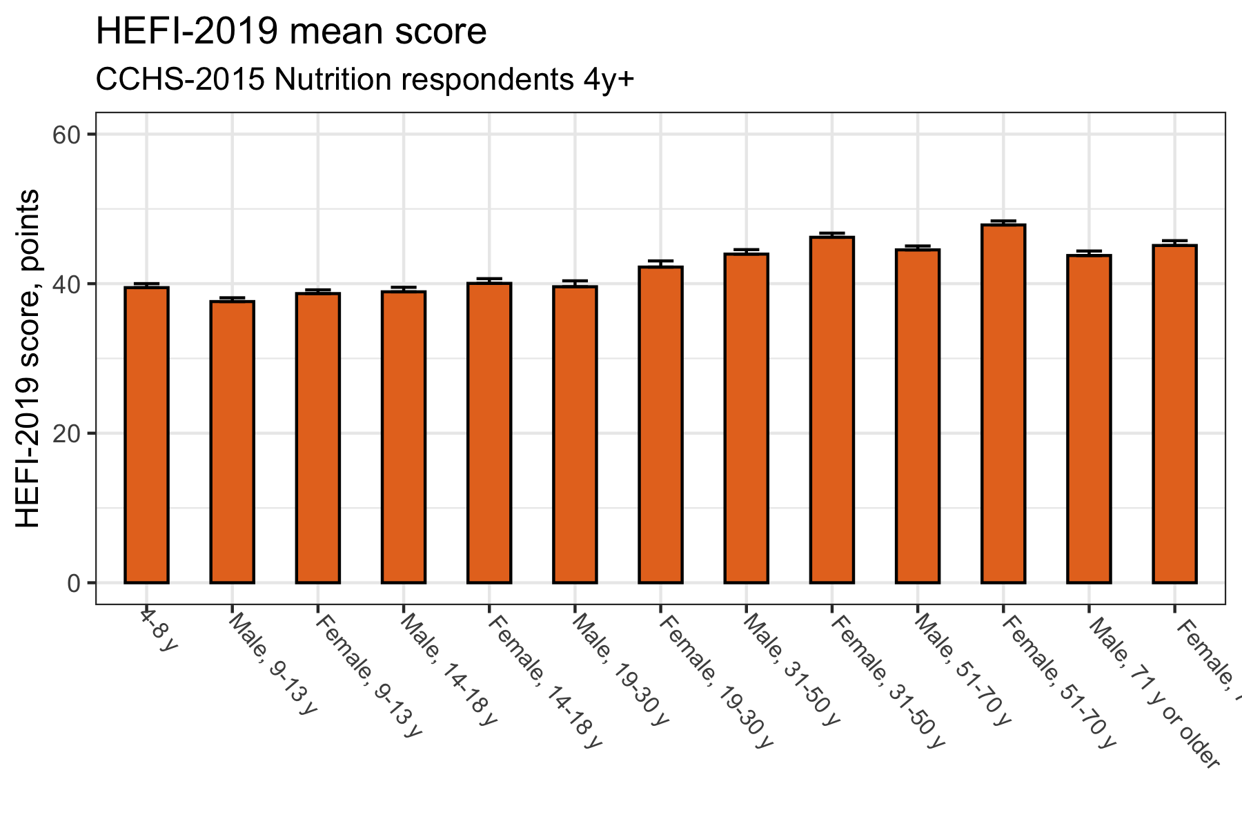
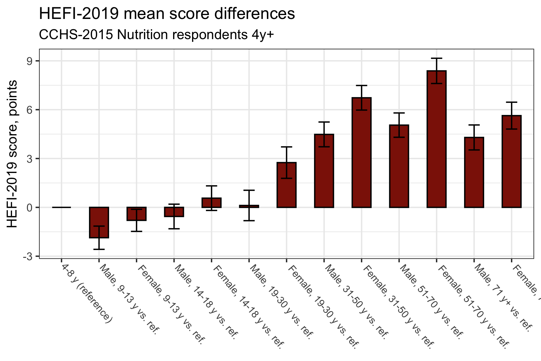
A common way to present means is the infamous dynamite plot or bar chart. Bar height reflect means and a measure of dispersion is often added, either standard deviation or standard errors. In the present example, I show standard errors, since we are using survey data.
Traditional plot 1: mean score
# Mean score only

distrib_hefi2019 |>
  filter(drig<9000) |> # note: focus on mean score
ggplot(aes(x=drig_f,y=estimate),stat="identity") +
  geom_col(width=0.5,color="black",fill="#e67424") +
  geom_errorbar(aes(ymin=estimate,ymax=estimate+se),width=0.3) +
  coord_cartesian(ylim=c(0,60)) +
  theme(axis.text.x = element_text(angle=-50, size=8,hjust=-0.1)) +
    # note: angle used to avoid overlapping axis text
  labs(title = "HEFI-2019 mean score",
       subtitle = "CCHS-2015 Nutrition respondents 4y+",
       x=NULL,y="HEFI-2019 score, points")
Traditional plot 2: difference of means
# Mean score difference

distrib_hefi2019 |>
  filter(drig>9000) |> # note: focus on mean score difference
ggplot(aes(x=drig_f,y=estimate),stat="identity") +
  geom_col(width=0.5,color="black",fill="#8d1c06") +
  geom_errorbar(aes(ymin=estimate-se,ymax=estimate+se),width=0.3) +
  theme(axis.text.x = element_text(angle=-50, size=8,hjust=-0.1)) +
    # note: angle used to avoid overlapping axis text
  labs(title = "HEFI-2019 mean score differences",
       subtitle = "CCHS-2015 Nutrition respondents 4y+",
       x=NULL,
       y="HEFI-2019 score, points")
What is suboptimal?
While there is nothing inherently wrong with the plots above, it is not a good use of space. In other words, there is a lot of “ink” to convey little information. Plus, vertical bars are not the best to show ranking. Again, it is not dramatic, but it is nonetheless hard to see what is actually happening at a glance.
Let’s try to interpret results to see why our traditional bar plots are not optimal. Based on the mean difference bar plot (second plot), try to answer the following questions:
- Compared with the 4-8 y group (reference), which age/sex group has the best diet quality?
- Which group has the second best diet quality?
- The third best diet quality?
Now, inversely,
- Compared with the 4-8 y group (reference), which age/sex group has the worst diet quality?
- Which group has the second worst diet quality?
- The third worst diet quality?
Perhaps answering the first question was not so hard. However, the interpretation does get harder as we refine questions. Fortunately, we can improve our plots to facilitate their reading.
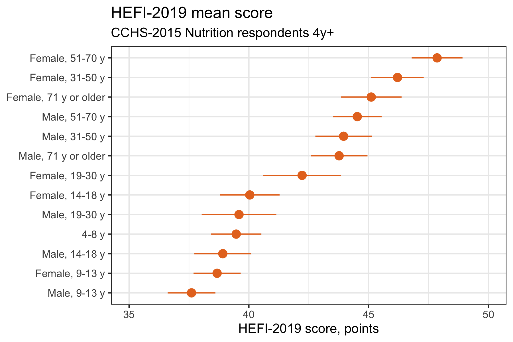
Enhanced plots: a better way
To improve the plots above, there are a couple of simple things we can do:
- Order groups by differences (or mean) to see ranking;
- Use dots instead of bars;
- Use 95% confidence intervals instead of standard errors;
- Show categories on the Y axis instead of X.
The ordering helps reader understand age/sex subgroups that are the most different from one another or the reference cateogry. The dots clearly identify the mean value. While Standard Deviation may be useful to show dispersion, 95%CI are a better choice to show differences of mean. Indeed, the CI reflect all values compatible with the data and thus will help understand the extent of those differences. Finally, the plotting of age/sex subgroups on the Y axis increases readability.
Enhanced plot 1: mean score
# Mean score only
distrib_hefi2019 |>
  filter(drig<9000) |>
  # (1) groups are ordered using <reorder> function
ggplot(aes(x=reorder(drig_f,estimate,na.rm=TRUE),y=estimate),stat="identity") +
  # (2) <geom_point> replaces <geom_col>
  geom_point(color="#e67424",size=3) +
  # (3) <geom_linerange> used to display 95%CI
  geom_linerange(aes(ymin=lcl95,ymax=ucl95),colour="#e67424") +
  scale_y_continuous(limits=c(35,50),breaks=seq(30,50,5)) +
  # (4) categories plotted on the Y axis
  coord_flip() +
  labs(title = "HEFI-2019 mean score",
       subtitle = "CCHS-2015 Nutrition respondents 4y+",
       x=NULL,y="HEFI-2019 score, points")
Enhanced plot 2: differences of mean
# Mean score difference

distrib_hefi2019 |>
  filter(drig>9000) |>
  # (1) groups are ordered using <reorder> function
ggplot(aes(x=reorder(drig_f,estimate,na.rm=TRUE),y=estimate),stat="identity") +
  #  (Bonus) add reference line at 0 for null difference
  geom_hline(yintercept=0,linetype="longdash",color="gray") +
  # (2) <geom_point> replaces <geom_col>
  geom_point(color="#8d1c06",size=3) +
  # (3) <geom_linerange> used to display 95%CI
  geom_linerange(aes(ymin=lcl95,ymax=ucl95),color="#8d1c06") +
  # (4) categories plotted on the Y axis
  coord_flip() +
  scale_y_continuous(breaks=seq(-2.5,10,2.5)) +
  labs(title = "HEFI-2019 mean score differences",
       subtitle = "CCHS-2015 Nutrition respondents 4y+",
       x=NULL,
       y="HEFI-2019 score, points")
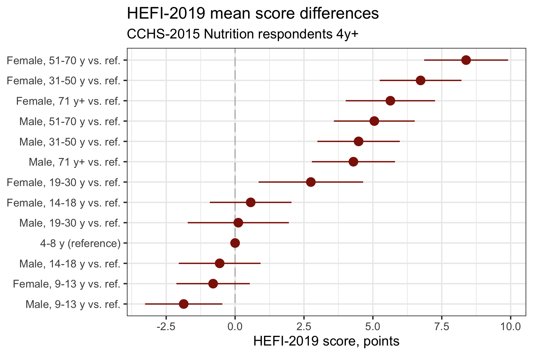
Now, try to answer the same questions, but based on the enhanced mean difference plot:
- Compared with the 4-8 y group (reference), which age/sex group has the best diet quality?
- Which group has the second best diet quality?
- The third best diet quality?
Inversely,
- Compared with the 4-8 y group (reference), which age/sex group has the worst diet quality?
- Which group has the second worst diet quality?
- The third worst diet quality?
Much easier isn’t it? The simple changes made above will help readers interpret the data. Both enhanced plots look very similar, but usually we would present the one that is the most consistent with the study objective, either ordered means or ordered differences.
You might also say that perhaps I could have ordered the bar charts the same way that I did with the dot plot; or that I could have used 95%CI for the bar chart too; or that I could have used horizontal bar charts. While all of this is true, the bar chart would still not be the best use of space. Dots are also better to visualize ranking (Cleveland, 1993).
Futher readings
Butler, R.C. (2022), Popularity leads to bad habits: Alternatives to “the statistics” routine of significance, “alphabet soup” and dynamite plots. Ann Appl Biol, 180: 182-195. https://doi.org/10.1111/aab.12734
Cleveland, William S. (1993). The Elements of Graphing Data. AT&T Bell Laboratories.
Healy, Kieran. (2018). Data Visualization - A Practical Introduction. Princeton University Press. Available at https://socviz.co.
Vail, A., & Wilkinson, J. (2020). Bang goes the detonator plot! Reproduction, 159(2), E3-E4. doi: https://10.1530/rep-19-0547