Nutrition data visualization: distribution
Published:
In this nutrition data visualization series, I aim to show how to visualize common statistics in health and nutrition. Or, at least, how I think it is best to visualize these data.
In this article, I focus on the case where we are interested in the distribution of intakes. You can skip the next section to see visualization code only.
Data overview
For the purpose of this blog, I use dietary intake data that have already been modelled to reflect usual intakes and were taken from the evaluation of the Healthy Eating Food Index (HEFI)-2019. These data are based on publicly available data from the Canadian Community Health Survey (CCHS) 2015 - Nutrition.
# ********************************************** #
#             Load required packages             #
# ********************************************** #

library(dplyr)
library(ggplot2)
library(haven)

# Set theme for all plots
theme_set(ggplot2::theme_bw())

# ********************************************** #
#             Load and prepare data              #
# ********************************************** #

distrib <-
  haven::read_sas(file.path("post_data","distribsub_t_strat30.sas7bdat")) |>
  # keep only rows that are group estimates
  dplyr::filter(strat3 %in% c(1,2,3)) |>
  # keep only relevant variables
  dplyr::select(strat3,c,p,value) |>
  # sort for clarity
  dplyr::arrange(strat3,c,p)

# Overview

head(distrib)
# A tibble: 6 × 4
  strat3     c     p value
   <dbl> <dbl> <dbl> <dbl>
1      1     1     1  2.66
2      1     1     2  3.12
3      1     1     3  3.43
4      1     1     4  3.68
5      1     1     5  3.90
6      1     1     6  4.08
  # note: <strat3> indicates sample stratum (kids and adolescents, males, females)
  # note: <c> is an index for HEFI-2019 components, which range from 1 to 10
  # note: <value> is the percentile estimate

# ********************************************** #
#         Add labels to numerical index          #
# ********************************************** #

distrib$strat3_f <-
  factor(distrib$strat3,
         levels = c(1,2,3),
         labels = c("Both sexes, 2-18 y",
                    "Males, 19y+",
                    "Females, 19y+"))

distrib$c_f <-
  factor(distrib$c,
         levels = seq(1,10,1) ,
         labels = c('C1 Vegetables and fruits',
                    'C2 Whole-grain foods',
                    'C3 Grain foods ratio',
                    'C4 Protein foods',
                    'C5 Plant-protein foods',
                    'C6 Fatty acids ratio',
                    'C7 Beverages',
                    'C8 Saturated fats',
                    'C9 Free sugars',
                    'C10 Sodium'))


table(distrib$strat3_f)
Both sexes, 2-18 y        Males, 19y+      Females, 19y+
               990                990                990
table(distrib$c_f)
C1 Vegetables and fruits     C2 Whole-grain foods     C3 Grain foods ratio
                     297                      297                      297
        C4 Protein foods   C5 Plant-protein foods     C6 Fatty acids ratio
                     297                      297                      297
            C7 Beverages        C8 Saturated fats           C9 Free sugars
                     297                      297                      297
              C10 Sodium
                     297
The data has percentile values arranged in the “long format” (i.e., on each row; from percentile 1 to 99), by component of the HEFI-2019 (1 to 10) and strata (Both sexes, 2-18 y; Males, 19y+; and Females, 19y+).
Simple plot: distribution for one continuous variable
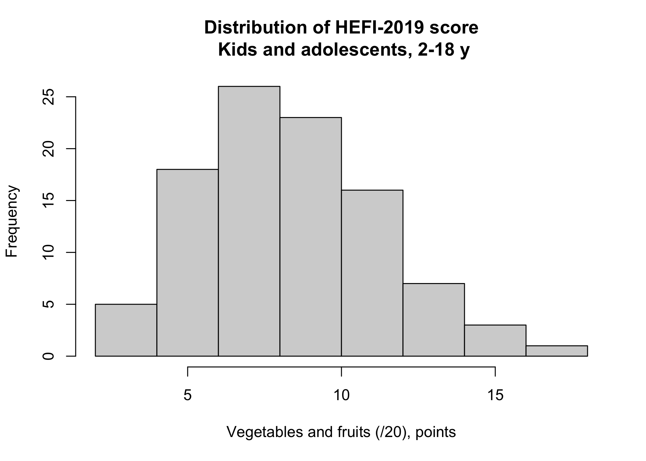
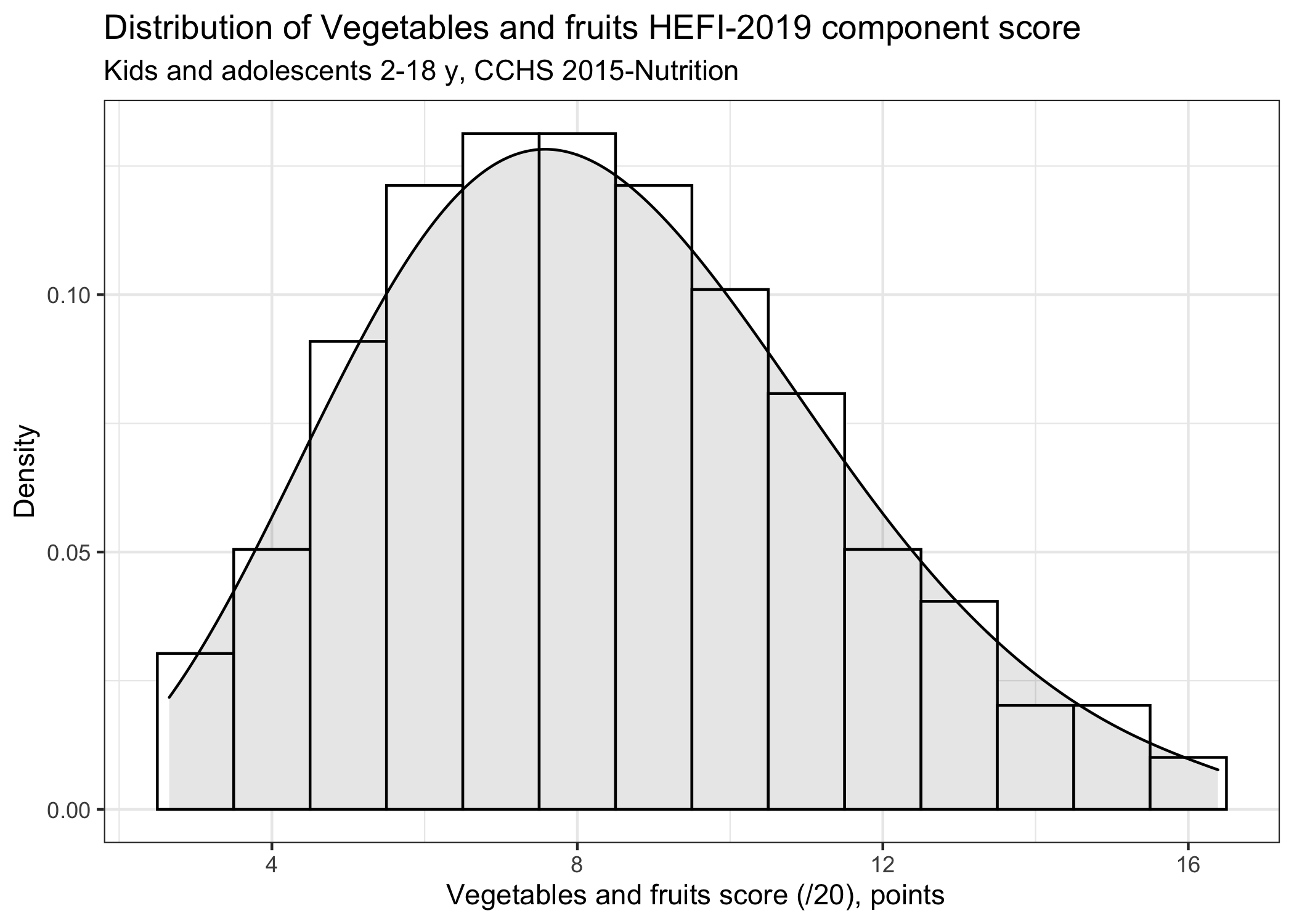
Say that we would like to visualize the score distribution for the Vegetables and fruits HEFI-2019 component and for kids and adolescents only. An histogram with a density curve would be appropriate for such purpose.
# ********************************************** #
#         Plot 1x histogram using base R         #
# ********************************************** #

hist(distrib[distrib$strat3==1 & distrib$c==1 ,]$value,
     main = "Distribution of HEFI-2019 score\n Kids and adolescents, 2-18 y",
     xlab = "Vegetables and fruits (/20), points")
# ********************************************** #
#         Plot 1x histogram using ggplot         #
# ********************************************** #

  distrib |>
  # note: use data from kids and adolescents only AND 1st component
  dplyr::filter(strat3==1 & c==1) |>
  ggplot(aes(x=value),stat="identity") +
  geom_histogram(binwidth = 1, aes(y=..density..), colour="black",fill="white") +
  geom_density(kernel="gaussian",fill="black",alpha=0.1) +
  labs(title="Distribution of Vegetables and fruits HEFI-2019 component score",
       subtitle="Kids and adolescents 2-18 y, CCHS 2015-Nutrition",
       y = "Density",
       x = " Vegetables and fruits score (/20), points")
However, we might want to visualize all 10 HEFI-2019 component scores. For this purpose, one could generate 10-times one histogram for each component and paste them together in an external software like Powerpoint.
I actually used to do this during my graduate studies. I tried to line up all plots as best as I could. Needless to say that this was a tedious task. Plus, as soon as I had to update my analysis, I had to copy/paste all plots all over again, line them up and so on. Not only was this very inefficient, it was also error-prone. Indeed, despite double-checking, it was very easy to forget updating values for one plot for example.
Fortunately, there is an elegant solution to this problem: the facet_wrap option in the ggplot package!
Efficient plot: distribution for many continuous variables
For this example, we still focus on kids and adolescents only, but we will plot all component scores in one figure.
# ********************************************** #
#       Plot many histograms using ggplot        #
# ********************************************** #

  distrib |>
  # note: use data from kids and adolescents only, but include ALL 10 components
  dplyr::filter(strat3==1) |>
  ggplot(aes(x=value),stat="identity") +
  geom_histogram(binwidth = 1, aes(y=..density..), colour="black",fill="white") +
  geom_density(kernel="gaussian",fill="black",alpha=0.1) +
  facet_wrap(~c_f, scales="free",nrow=2) +
  # note: in <facet_wrap>, we must indicate that axis should be independent from one another using <scales="free">,
  #since HEFI-2019 components do not always have the same total
  labs(title="Distribution of HEFI-2019 component scores",
       subtitle="Kids and adolescents 2-18 y, CCHS 2015-Nutrition",
       y = "Density",
       x = "Component score, points")
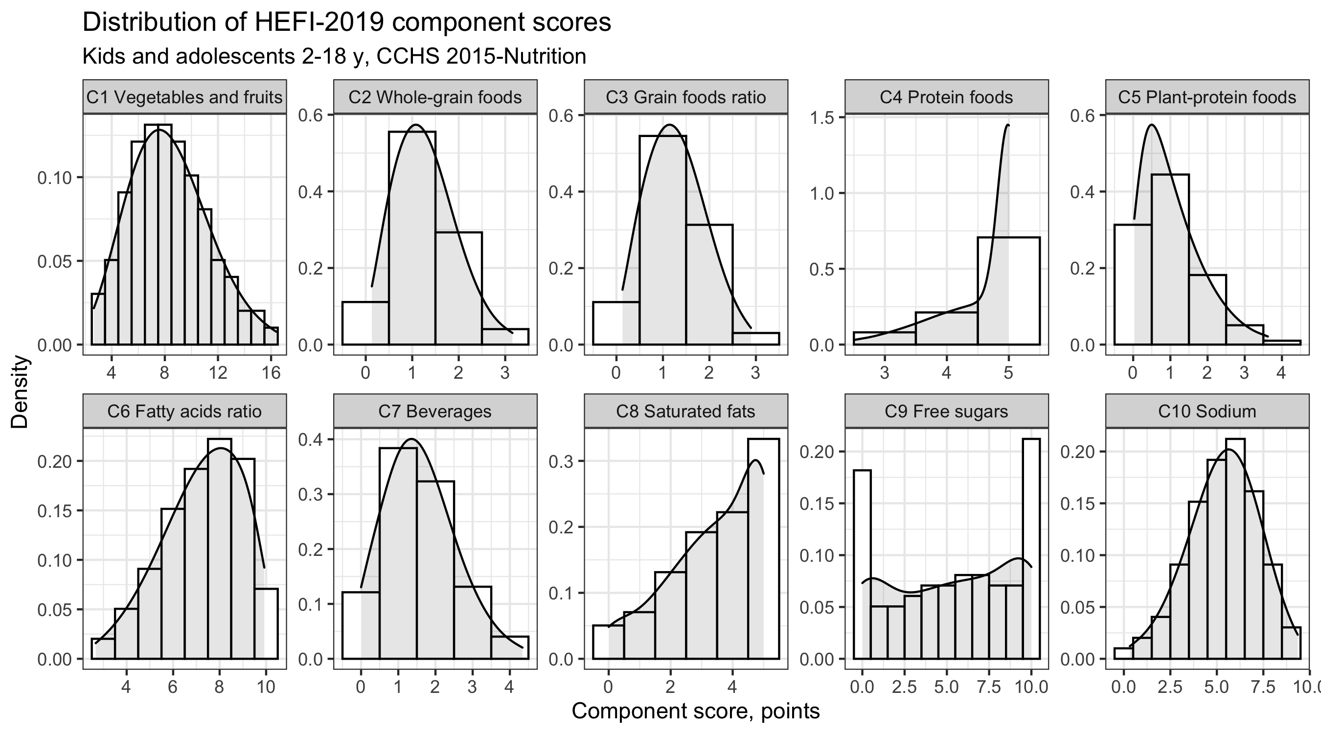
The facet_wrap option of the ggplot package allows us to plot 10 histograms using only one line of code. Further customization is also possible (axis lines, range for values). No more manual “lining-up”! No more tedious copy-paste! Once I discovered facet_wrap, I never went back to creating plot manually.
Efficient plot 2: distribution for many continuous variables and many groups
We can add one layer of complexity to the plot above by considering all groups at once instead of focusing only on one group (i.e, children and adolescents).
For example, one might be interested in comparing distribution among groups. In this case, it is best to plot the distribution we wish to compare in the same plot. To avoid overplotting, we keep only the density curves in the plot below and remove histograms.
# ********************************************** #
#     Plot many density curves using ggplot      #
# ********************************************** #

  distrib |>
  # note: use data from all strata AND all 10 components
  ggplot(aes(x=value, group=strat3_f),stat="identity") +
  geom_density(aes(fill=strat3_f,colour=strat3_f),kernel="gaussian",alpha=0.3) +
  facet_wrap(~c_f, scales="free",nrow=2) +
  theme(legend.position = "top",
        legend.direction = "horizontal") +
  labs(title="Distribution of HEFI-2019 component scores",
       subtitle="Respondents 2y or older, CCHS 2015-Nutrition",
       y = "Density",
       x = "Component score, points")
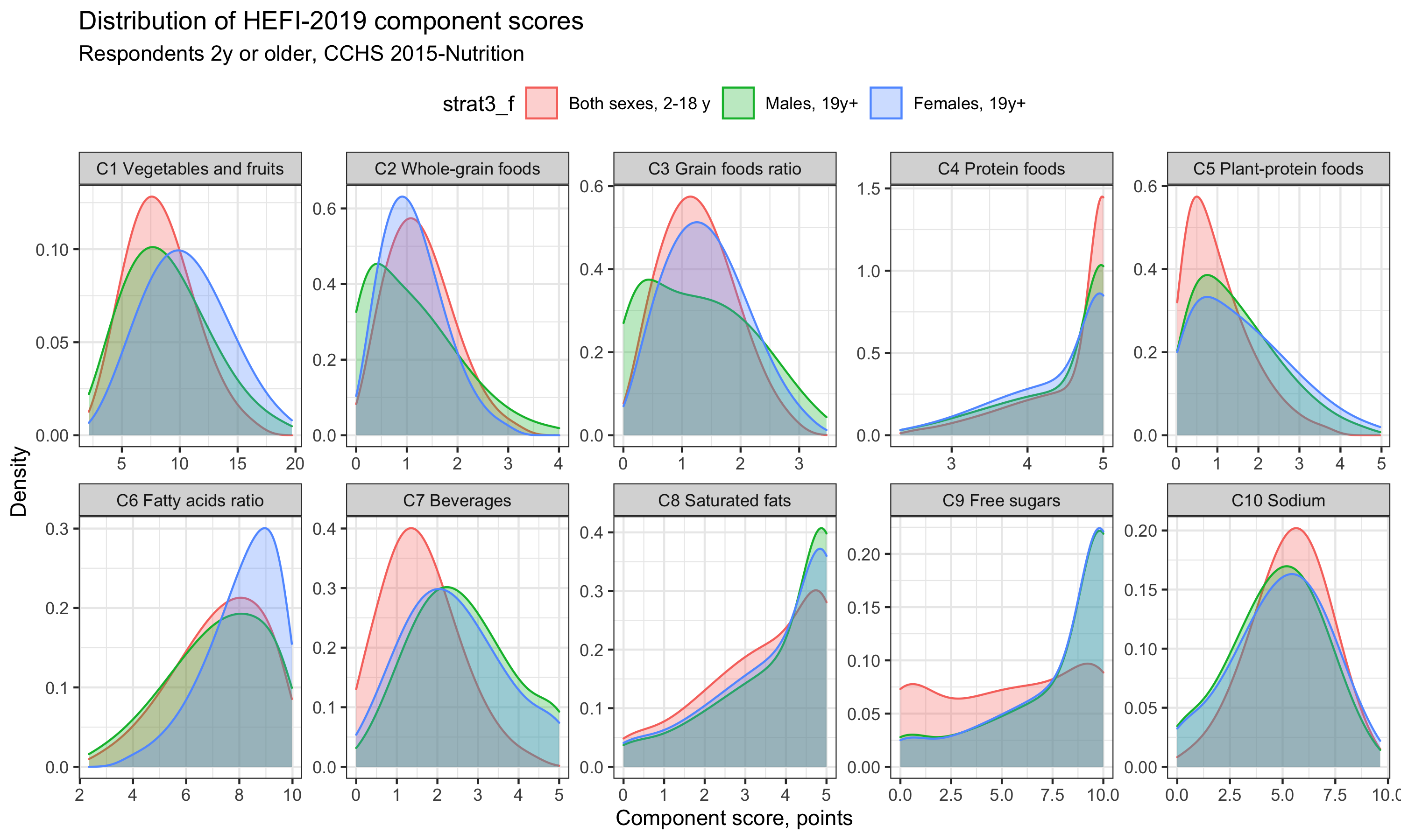
We can see that the distribution for Beverages and Free sugars are particularly skewed towards lower score for children and adolescents compared with adults. Of note, had we been interested in differences across percentiles, a different plot may have been more relevant. Indeed, the current plot does not allow us to quickly grasp the extent of differences among subgroup distribution. Regardless, I find amazing that we can produce a graph with great complexity with only a few lines of code!
Efficient plot 3: cumulative distribution for many continuous variables and many groups
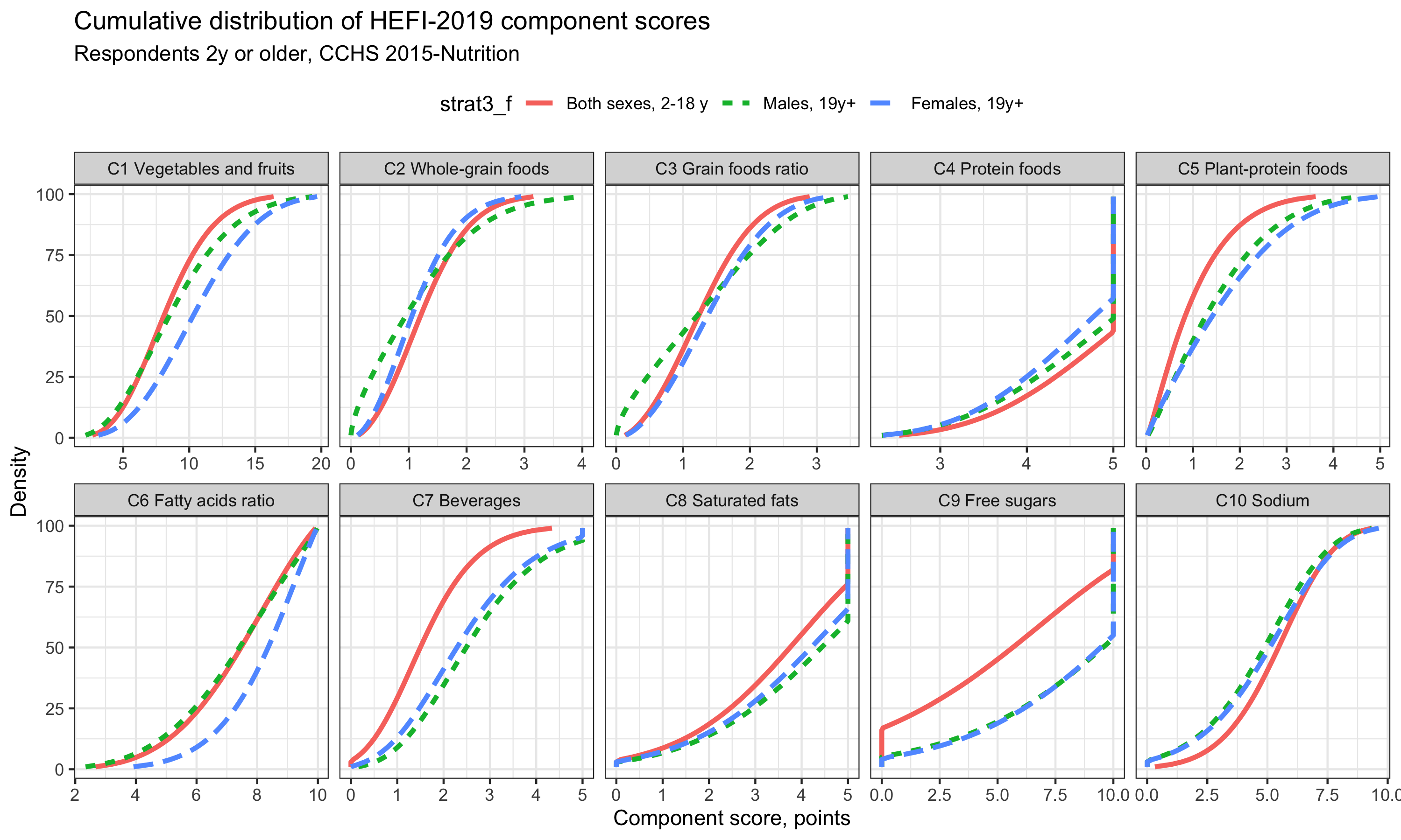
Finally, we can also show cumulative distribution. Admittedly, I find cumulative distribution a bit more difficult to interpret when used with many subgroups as in the example below. Perhaps we should focus on one group only. However, cumulative distribution plots have the advantage to show directly the percentile values. For example, for the Vegetables and Fruits score distribution (first component), we see that 10 points (/20) is approximately the 50th percentile (median), the 63th percentile and the 75th percentile of Females 19y+, Males 19y+ and kids/adolescents 2-18y, respectively.
# ********************************************** #
#   Plot cumulative distributions using ggplot   #
# ********************************************** #

  distrib |>
  # note: use data from all strata AND all 10 components
  ggplot(aes(x=value,y=p, group=strat3_f),stat="identity") +
    # note: <p> indicates percentile value for each X (e.g., 1, 2, 3, ... 99)
  geom_line(aes(colour=strat3_f,linetype=strat3_f),size=1.2) +
  facet_wrap(~c_f, scales="free_x",nrow=2) +
    # note: because percentile values are common for each component, we use "free_x" only
  theme(legend.position = "top",
        legend.direction = "horizontal") +
  labs(title="Cumulative distribution of HEFI-2019 component scores",
       subtitle="Respondents 2y or older, CCHS 2015-Nutrition",
       y = "Density",
       x = "Component score, points")
Exemple papers showing score distributions
Brassard D, Elvidge Munene LA, St-Pierre S, et al. Evaluation of the Healthy Eating Food Index (HEFI)-2019 measuring adherence to Canada’s Food Guide 2019 recommendations on healthy food choices. Appl Physiol Nutr Metab 2022. doi:10.1139/apnm-2021-0416
Dugas C, Brassard D, Bélanger M, et al. Determinants of Healthy Diet Among Children Exposed and Unexposed to Gestational Diabetes. J Nutr Educ Behav 2022. doi: 10.1016/j.jneb.2021.11.003.
Tarasuk V, Brassard D. The effect of consuming voluntarily fortified food and beverages on usual nutrient intakes in the Canadian population. Food Nutr Res 2021. doi: 10.29219/fnr.v65.5256.
