Nutrition data visualization: proportions and ratios
Published:
In this nutrition data visualization series, I aim to show how to visualize common statistics in health and nutrition. Or, at least, how I think it is best to visualize these data.
In this article, I focus on the case where we are interested in proportions. Often, we want to compare two proportions. In a survey, proportions (named prevalence) are compared using prevalence ratio; in a cohort study, proportions (named risks) are compared using risk ratios. Other examples of summary statistics for proportions include odds ratio (e.g., case-control study), hazard ratios (e.g., survival analysis), etc.
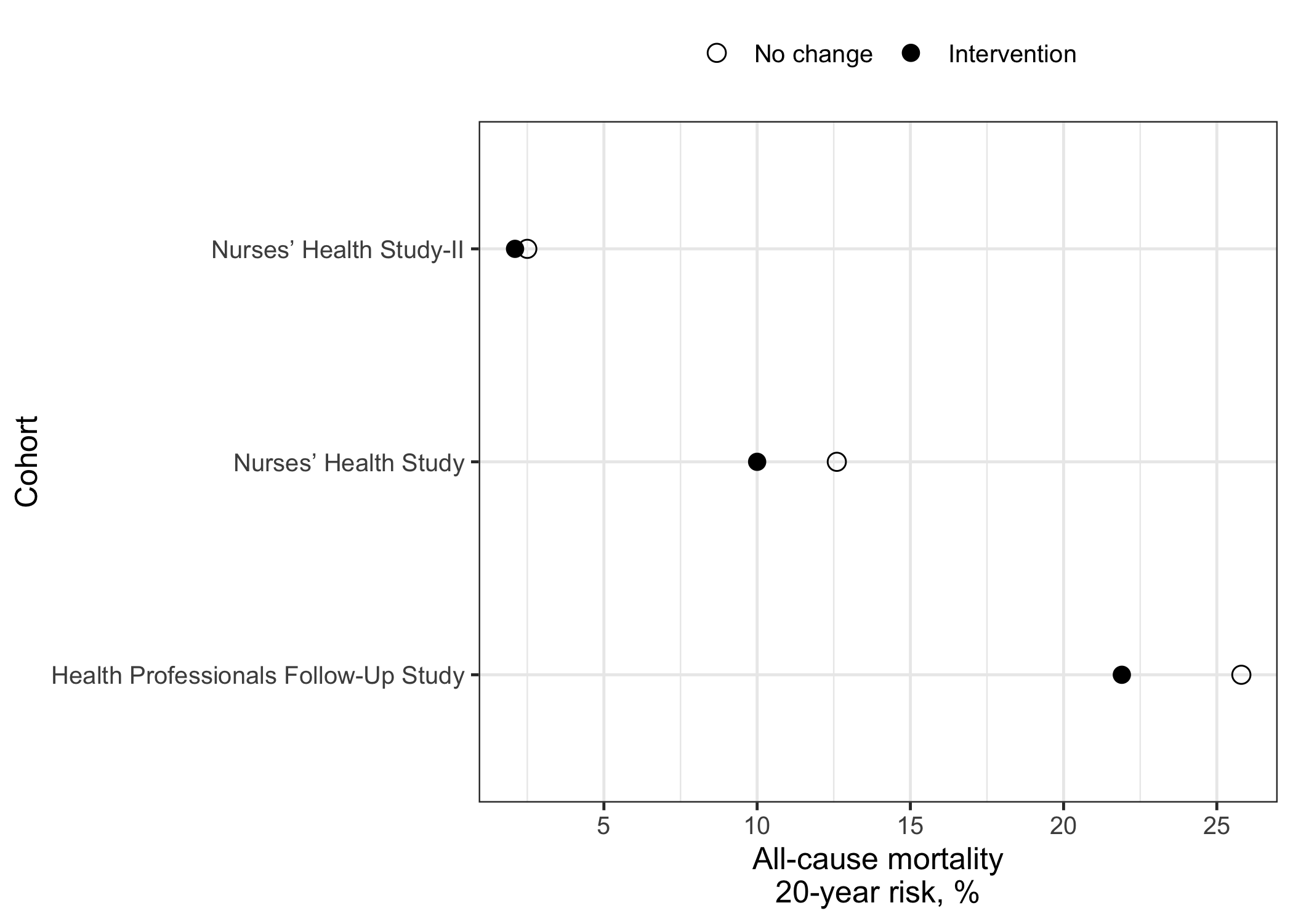
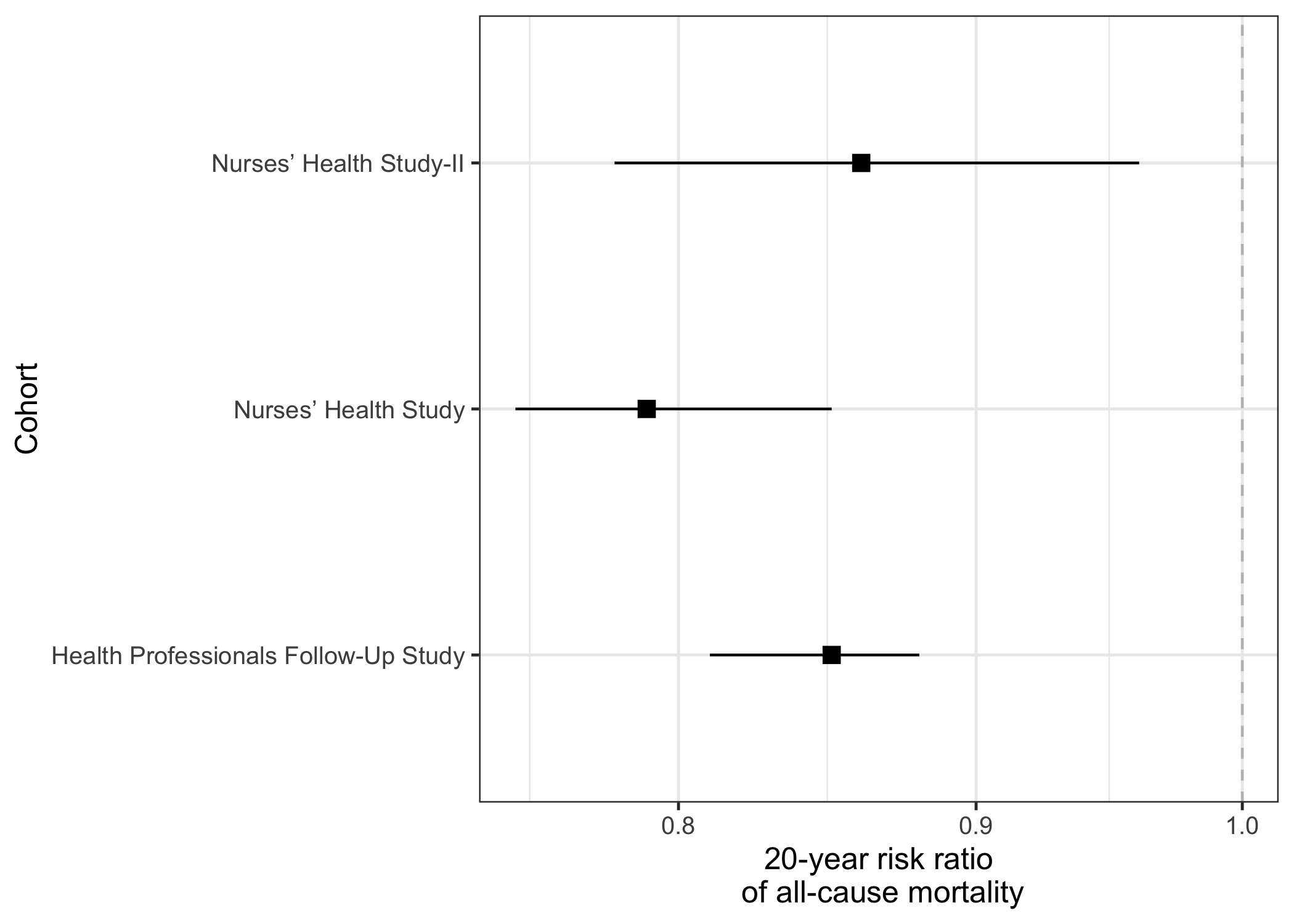
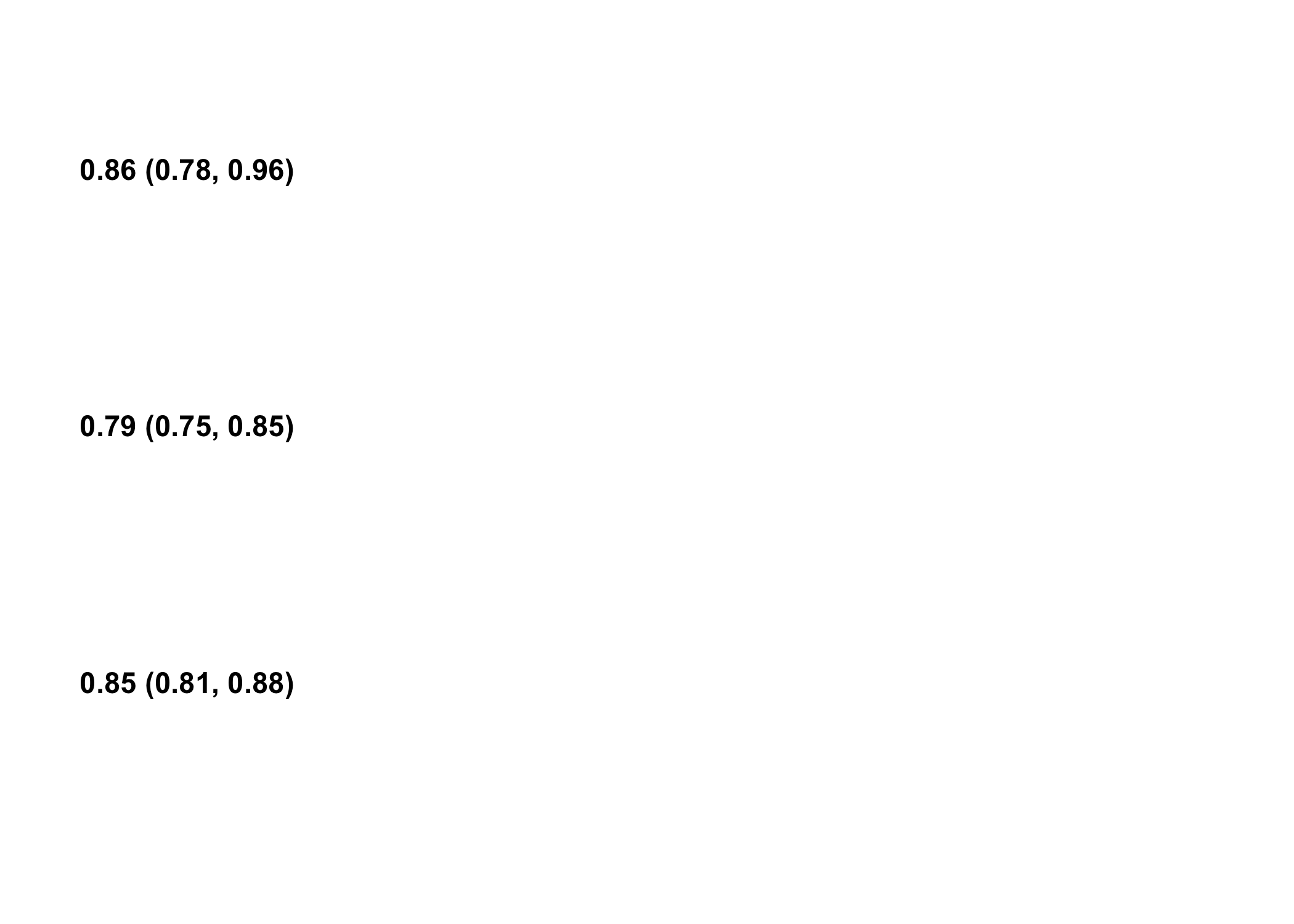
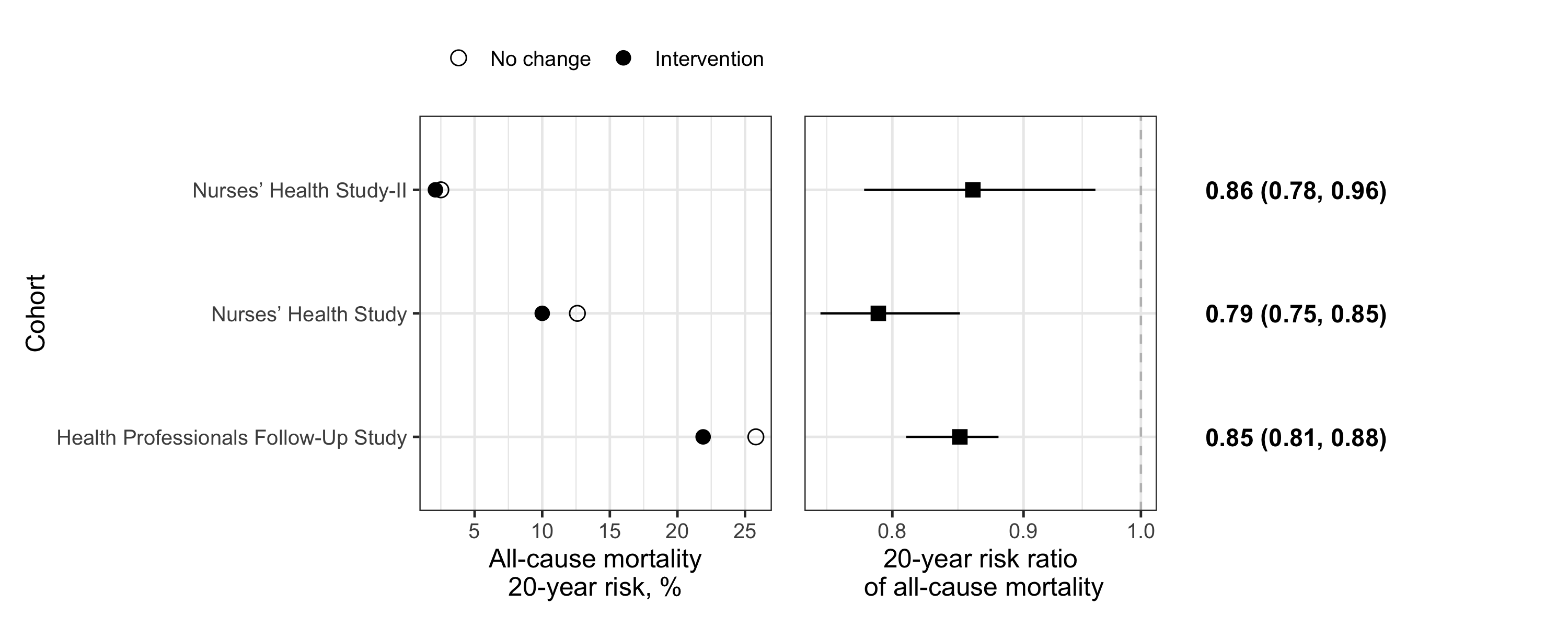
The graph I like to use for an efficient visualization of ratios is a combination of three panels: two dot plots and summary statistics. The first panel presents the crude proportions for the group being compared while the second panel presents the measure of association (i.e., ratio of proportions). The panel of summary statistics provide exact numbers. All three panels can be generated using the ggplot2 package and then combined with the patchwork package.
Data Overview
For the purpose of this blog, I use data published in the article entitled Estimating the effect of nutritional interventions using observational data: the American Heart Association’s 2020 Dietary Goals and mortality (Chiu et al. 2021). I suggest you read the article if you are interested in causal inference methods applied to nutrition - or any other lifestyle habits.
More specifically, I retrieve data directly from Table 4. The table presents all-cause mortality risks under “no intervention/no change” or a “hypothetical nutrition interventions” in 3 large cohorts from the US. In this example, the proportions are risks and the corresponding ratios are risk ratios.
The risk ratios indicate the extent to which the all-cause mortality risk is modified upon adhering to “hypothetical” nutrition intervention in these cohorts.
# ********************************************** #
#        Manually input table information        #
# ********************************************** #

# note:
# risk0 = risk under no intervention
# risk1 = risk under hypothetical intervention

chiu2021 <-
  tibble::tribble(
  ~cohort, ~risk0, ~risk1, ~rr_estimate, ~rr_lcl, ~rr_ucl,
  1, 25.8, 21.9, 0.85, 0.81, 0.88,
  2, 12.6, 10.0, 0.79, 0.75, 0.85,
  3, 2.5, 2.1, 0.86, 0.78, 0.96)

# add cohort name as factor
chiu2021$cohort_f <-
  factor(
    chiu2021$cohort,
    levels = c(1, 2, 3),
    labels = c("Health Professionals Follow-Up Study",
               "Nurses’ Health Study",
               "Nurses’ Health Study-II"))

# overview
head(chiu2021)
# A tibble: 3 × 7
  cohort risk0 risk1 rr_estimate rr_lcl rr_ucl cohort_f
   <dbl> <dbl> <dbl>       <dbl>  <dbl>  <dbl> <fct>
1      1  25.8  21.9        0.85   0.81   0.88 Health Professionals Follow-Up S…
2      2  12.6  10          0.79   0.75   0.85 Nurses’ Health Study
3      3   2.5   2.1        0.86   0.78   0.96 Nurses’ Health Study-II
Notice that I entered the risks in the “wide” format, i.e., on the same rows to facilitate data entry. For the first panel, some data manipulations are needed to obtain a “tidy” data set where each observation are rows.
Dot plots and summary statistics
Panel 1: crude proportions
The first dot plot shows the crude proportions for each group (“no intervention/no change” or “intervention”). In other words, the prevalence or risk within each group separately. In the code below, I transform the data from wide to tall/long and generate the dot plot.
# ********************************************** #
#              Load packages needed              #
# ********************************************** #

library(ggplot2)
library(patchwork)

# set default theme to <theme_bw> and increase base text size to 12 pts
ggplot2::theme_set(theme_bw(base_size=12))

# ********************************************** #
#              Prepare 'tidy' data               #
# ********************************************** #

chiu2021_long <-
  chiu2021 |>
  # remove variables not needed for first panel
  dplyr::select(-tidyr::starts_with("rr")) |>
  # transform proportions to tall/long data (instead of wide)
  tidyr::pivot_longer(
    cols = c("risk0","risk1"),
    values_to = "risk",
    names_to  = "scenario"
  )

# factorize the scenario
chiu2021_long$scenario_f <-
  factor(chiu2021_long$scenario,
         levels = c("risk0", "risk1"),
         labels = c("No change",
                    "Intervention")
  )

# overview
head(chiu2021_long)
# A tibble: 6 × 5
  cohort cohort_f                             scenario  risk scenario_f
   <dbl> <fct>                                <chr>    <dbl> <fct>
1      1 Health Professionals Follow-Up Study risk0     25.8 No change
2      1 Health Professionals Follow-Up Study risk1     21.9 Intervention
3      2 Nurses’ Health Study                 risk0     12.6 No change
4      2 Nurses’ Health Study                 risk1     10   Intervention
5      3 Nurses’ Health Study-II              risk0      2.5 No change
6      3 Nurses’ Health Study-II              risk1      2.1 Intervention
  #note: notice that each cohort now has two rows

# ********************************************** #
#  Use ggplot to generate first dot plot panel   #
# ********************************************** #

panel1 <-
  chiu2021_long |>
  ggplot(aes(y=cohort_f, x=risk, shape=scenario_f)) +
  geom_point(size=3) +
  scale_shape_manual("",values=c(1,16)) +
  labs(x="All-cause mortality\n20-year risk, %",y="Cohort") +
  theme(
    legend.position = "top"
  )

  # note: 'cohort' are shown on the Y-axis because it is easier to visualize

# show output
  panel1

Panel 2: (risk) ratios
The second panel shows the ratios, i.e., the comparison between the two proportions. In this example, the comparison between the two proportions is the risk ratio.
# ********************************************** #
#  Use ggplot to generate second dot plot panel  #
# ********************************************** #

#note: data transformations are not needed here since there is only 1 statistic per cohort

panel2 <-
  chiu2021 |>
  ggplot(aes(y=cohort_f, x=rr_estimate)) +
  geom_point(shape=15, size=3) + # square shape used to differentiate vs. risk
  geom_vline(xintercept=1, linetype="dashed", color="gray") + # null effect estimates
  scale_x_log10() + # ensure proper comparison when there are RR<1 and RR>1
  geom_linerange(aes(xmin=rr_lcl, xmax=rr_ucl)) +
  labs(x="20-year risk ratio\n of all-cause mortality",y="Cohort")

# show output
  panel2

Panel 3: summary statistics
The third panel shows the summary statistics, i.e., the risk ratio estimates and their 95% confidence interval. While the second panel above already presents this information, some readers may prefer to have the exact numerical values.
The code below shows how to generate the numerical values while ensuring that they are aligned with the other panels.
# ********************************************** #
#       Create special theme for text only       #
# ********************************************** #

# note: I initially found this solution somewhere online,
# but I can't find the reference...

theme_table <-function(){
  theme(#plot.subtitle = element_text(hjust = 0.5), ## centering (sub)title on text
  axis.text.x=element_text(color="white"),
  axis.line=element_blank(),
  axis.text.y=element_blank(),axis.ticks=element_blank(),
  axis.title.y=element_blank(),
  legend.position="none",
  panel.background=element_blank(),
  panel.border=element_blank(),
  panel.grid.major=element_blank(),
  panel.grid.minor=element_blank(),
  plot.background=element_blank()
  )
}

# ********************************************** #
#     Use ggplot to generate panel of stat.      #
# ********************************************** #

panel3 <- chiu2021 |>
  # combine estimate with 95CI
  dplyr::mutate(
    estimate_ci = paste0(rr_estimate," (", rr_lcl, ", ", rr_ucl,")")
  ) |>
  ggplot(aes(y=cohort_f)) +
  labs(y=NULL,x="  ") +
  theme_table() +
  geom_text(aes(x=0, label=estimate_ci, fontface=2), hjust = 0 ,size=4) + xlim(0,1)

panel3

Combining the three panels
Now that the three panels are created, we can use the patchwork package to generate the final three-panel figure. With patchwork, simple arithmetic operators are used to combine the indiviudal ggplot objects. For example, panel1 + panel2 + panel3.
# ********************************************** #
#         Combine panels with patchwork          #
# ********************************************** #

panel_combined <-
  panel1 +
  (panel2 + theme(axis.title.y = element_blank(),
                  axis.text.y = element_blank(),
                  axis.ticks.y = element_blank())) +
  # note: labels in the second panel are removed since they already appear in panel 1
  panel3

panel_combined

Conclusion
Although the final graph is a bit plain, I believe it would be suitable for publication in a scientific journal. Indeed, it clearly shows the crude risk within each group, their ratio, as well as the confidence interval. The summary statistics on the right allow readers to have full information. It is an efficient use of space and the horizontal dots and lines facilitate effect size comparisons. Of note, the three-panel approach also works well to present mean and difference of means among two groups, as long as units are consistent across categories on the Y-axis.
One caveat is that the current arrangement of panels makes it challenging to compare more than 2 groups. For instance, if we had three interventions, it would be difficult to show all pairwise comparisons.
Finally, for presentation purpose, it might be nicer to add colours, annotations or highlight specific estimates; ggplot2 offers many possibilities for customization. We could also have reordered the risk ratio estimate to rank them by effect size (using stats::reorder), but it was not essential in the present example as there were only three categories (“Cohort”) on the Y-axis.
Reference
Chiu, Y. H., Chavarro, J. E., Dickerman, B. A., Manson, J. E., Mukamal, K. J., Rexrode, K. M., Rimm, E. B., & Hernan, M. A. (2021). Estimating the effect of nutritional interventions using observational data: the American Heart Association’s 2020 Dietary Goals and mortality. Am J Clin Nutr. https://doi.org/10.1093/ajcn/nqab100
